
 Animation

 Branding

Ooble
Ooble is a homeware brand that wants you to love being at home. Think soft bedding, throws made for sinking into and rugs with real character – all at prices that feel as good as they look.
The visual identity
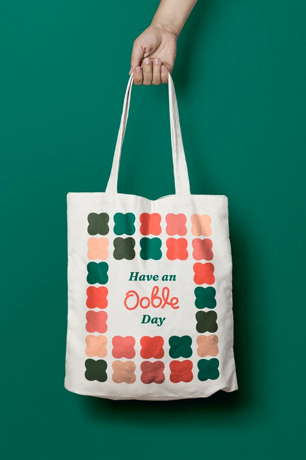
Ooble wanted to feel like the best bit of being at home: the sofa at the end of a long day or the throw you always reach for. So we built the identity around warmth and softness with a feel good factor.
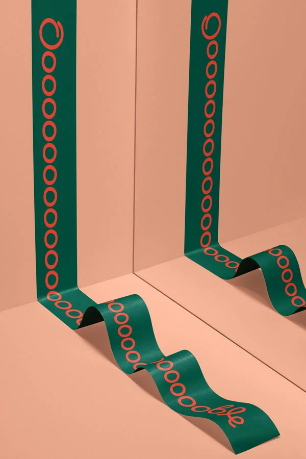
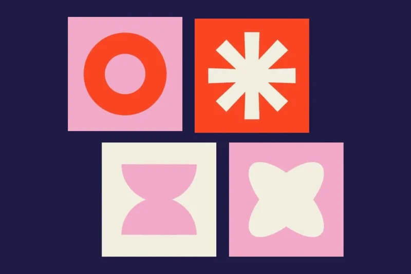
The squircle was the obvious choice to carry the brand. Half square, half circle, it’s basically a cushion! The wordmark is a hand-drawn script with round, generous loops and its two Os become a pair of eyes, giving the brand a smiley face that turns up everywhere, from social posts to the packaging