
 Animation

 Branding

4 min read
Fonts we’ve used in recent branding projects: Part 1
Type is such a massive part of a brand’s visual identity. Your brand fonts can often do more talking than your logo. Here are four absolute belters from our favourite independent type foundries. They’re all very different, and each one has been the star of a recent client project.
Kaio – Lift Type
Kaio from Lift Type is a ridiculously cool typeface that we used for a cheeky, playful dupes perfume brand, Smel. – when working with the amazing Muddy Wellies.
It’s drawn by Romain Oudin at Lift Type, a small foundry in Montpellier, and takes its cues from classics like Gill Sans and Antique Olive… but with a modern twist and plenty of character. The name comes from Master Kaio in Dragon Ball Z (I’ve just had to Google that!), so it doesn’t take itself too seriously either. That suited Smel., a brand that pokes fun at how pretentious the fragrance industry can be.
Aeonik – CoType
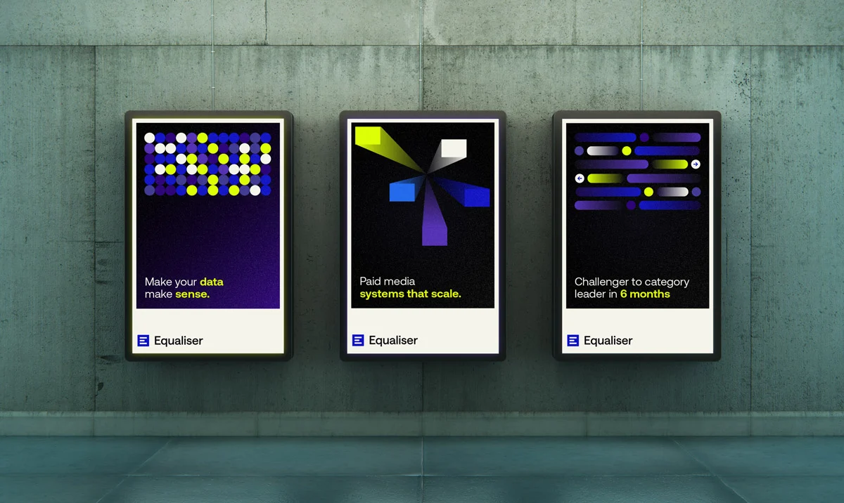
Aeonik by CoType Foundry. What can I say? One of my absolute favs, perfect for Equaliser – where data is a key part of the brand. It’s precise, but the geometric nature doesn’t make it cold.
Designed by Mark Bloom of CoType in 2019 Aeonik is a geometric sans serif precise without feeling cold. It’s grown into a big family, with Aeonik Pro, Mono, Condensed, Extended and more recently Aeonik Soft, so it covers everything from headlines to the small print on a chart.
If I could only use one font for the rest of my design life. 99% sure it would be Aeonik.
In the Equaliser project it was used for the logo, heading and body copy!
Youth – AllCaps

Youth by AllCaps – climbs to the top for the new GB Climbing logo ahead of the LA Olympics 2028.
AllCaps was set up in 2018 by Ondřej Báchor and Jan Novák, and Jan designed Youth in 2022. The British Mountaineering Council asked us to update a much-loved logo without losing what made it special, so the climber was redrawn and the logotype was changed for Youth bold.
Youth by AllCaps feels sporty and full of energy, perfect for Team GB’s climbers. Its bold cuts and rounded corners sit comfortably alongside the curves of the climber in the logo.
Birdie – Taylor Penton
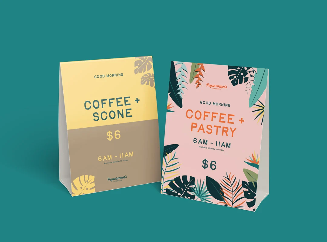
Birdie by Taylor Penton giving a wholesome vibe for Paperman’s Coffeehouse in the Cayman Islands.
Birdie was one of Taylor Penton’s first fonts (I didn’t realise until writing this!), and it went on to inspire Big Bird and Wingman.
Paperman’s takes its name from Norman Paperman, who leaves his New York job to open a coffee shop in the Caribbean in the novel Don’t Stop the Carnival, so the type needed to feel warm, local and a little bit nostalgic.
Yowza – Blaze Type
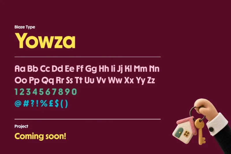
Yowza by Blaze Type. Obsessed! You’ll have to wait for the project, but here’s a sneak peek 👀
This is just a handful of the fonts we’ve used – so stay tuned for part 2!

Not another newsletter!
Don't worry, it's infrequent, spam-free and even cures minor ailments!
"*" indicates required fields